Designing Inspired Wellness

Client
Wellness Collective
Industry
Health & Wellness
Location
Dubai, UAE
Agency
SEVENT3 Marketing

he Solution: "Structure & Softness

Sevent3 developed a visual language rooted in the concept of “Grounded Guidance.” We moved away from sterile medical aesthetics and avoided the clichés of overly rustic “boho” wellness brands. Instead, we aimed for Emotional Clarity.


The Logo Mark


We engineered a mark built on symmetry to reflect balance, care, and clarity.

  • The Foundation (The Leaf): The base of the logo features upward-curving, leaf-like shapes. These symbolize growth, grounding, and support—the “roots” of the client’s journey.

  • The Guide (The Star): Floating above the base is a four-point star. This represents guidance, healing, and the “spark” of emotional clarity.

  • The Composition: By utilizing negative space and precise curves, the icon feels uplifting yet stable. It is professional enough for a letterhead but soft enough for a wellness product label.

The Challenge

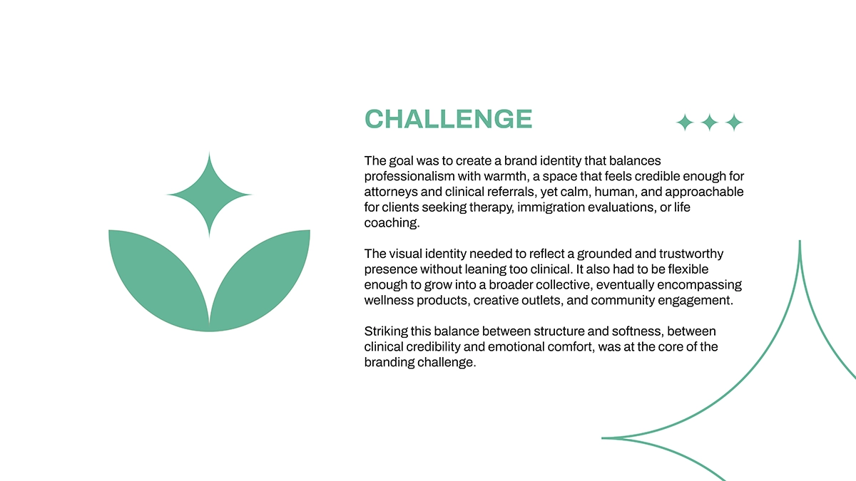
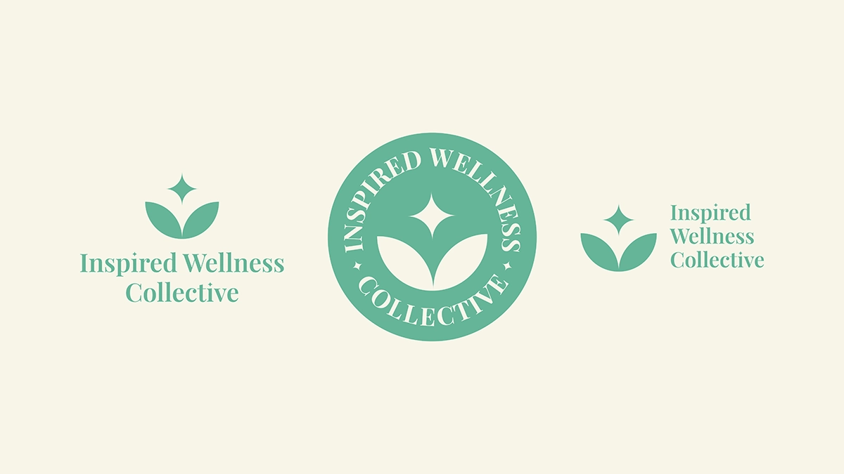
nspired Wellness Collective approached Sevent3 with a complex positioning problem. They needed a brand identity that could walk a very fine line between two distinct audiences:

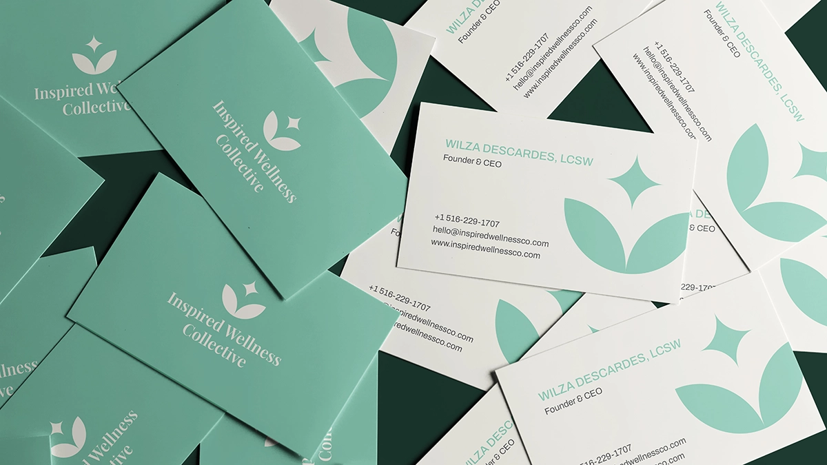
  1. Professional Referrals: The brand needed to feel credible and structured enough for attorneys and clinical professionals to feel comfortable referring clients.

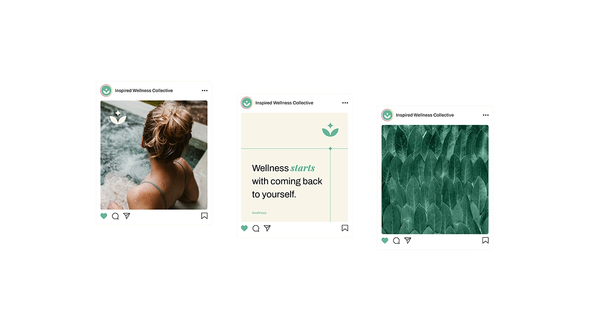
  2. The Clients: The brand needed to feel warm, human, and approachable for individuals seeking therapy, immigration evaluations, or life coaching.

Furthermore, the identity had to be scalable. It couldn’t look like a solo practitioner’s office; it needed the flexibility to grow into a broader “collective” encompassing future wellness products, creative outlets, and community events.

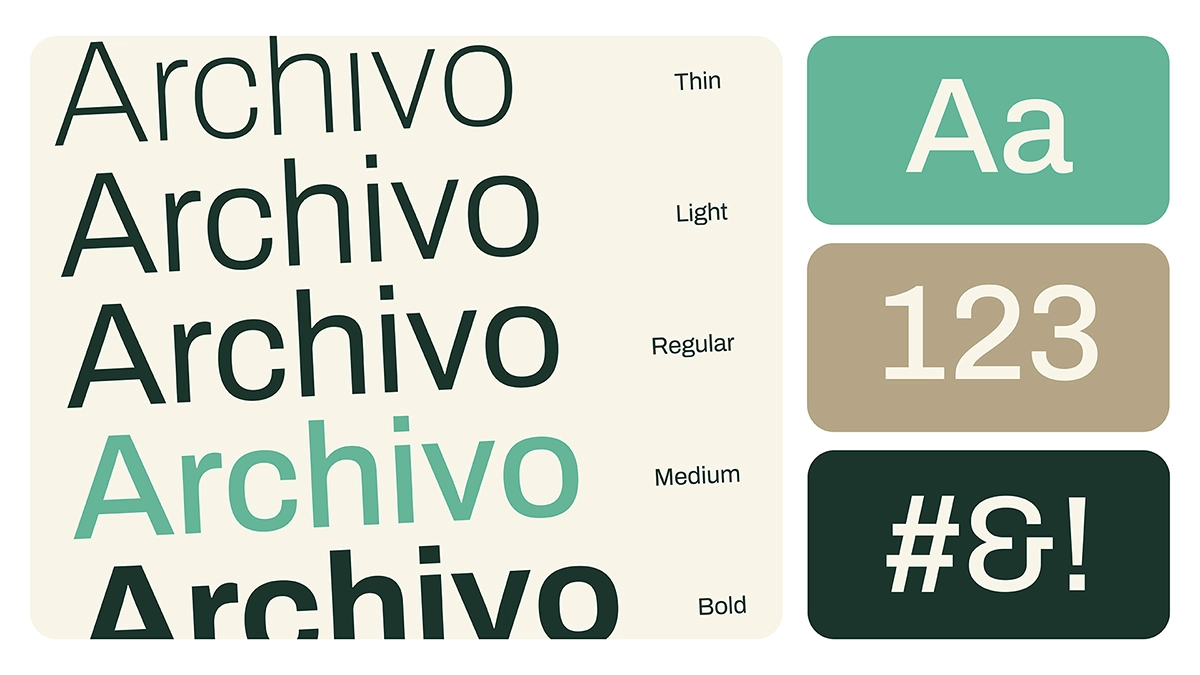
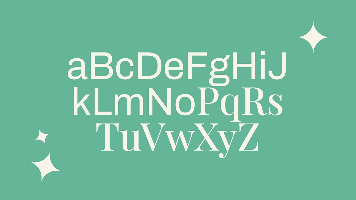
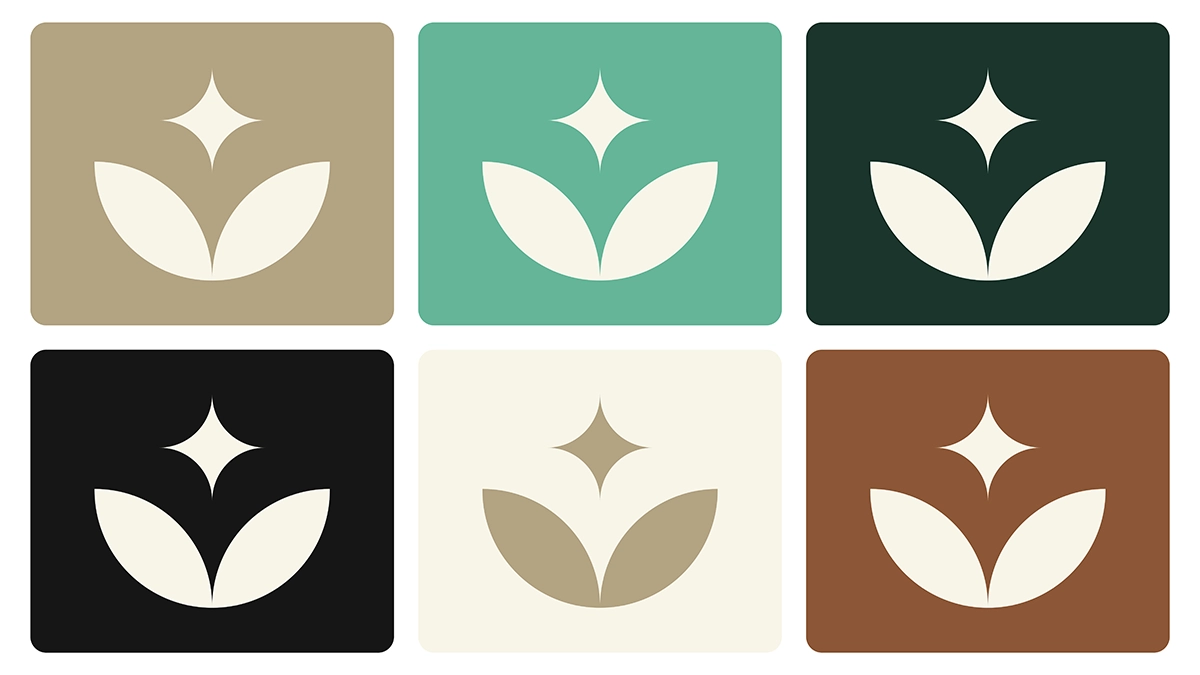
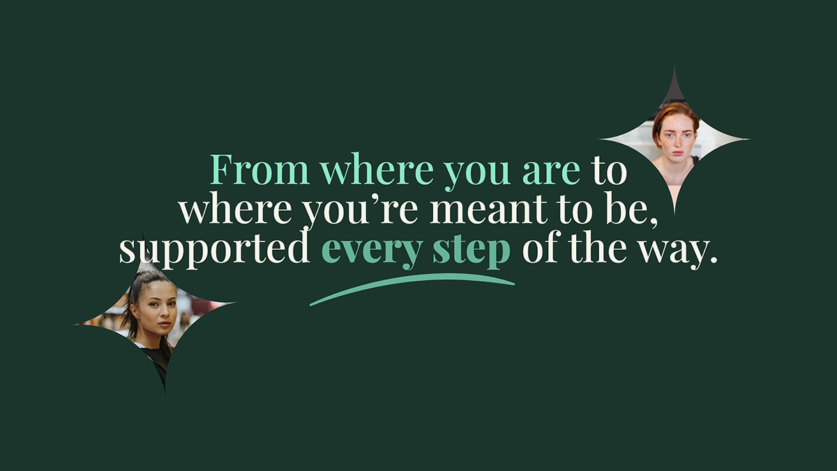
The Core Question: How do you create a visual presence that offers structure without being rigid, and softness without lacking authority?

The Visual System

The Color Palette


We moved beyond standard “medical blues” to an earth-inspired palette that communicates nurturing and trust.

  • Primary Tones: Evergreen Mist acts as the anchor (trust-building and bold), while Ivory Glow provides necessary negative space for breathability.

  • Supporting Tones: Clay Beige and Verdant Calm offer a soft, neutral background that allows the content to shine without overwhelming the viewer.

  • Accents: Terracotta Root adds a human, emotional touch, while Moon Shadow serves as a high-contrast alternative to harsh black for text and accessibility.


Typography


To mirror the “Structure & Softness” strategy, we utilized a dual-font system:

  • Headings (Playfair Display): A sophisticated serif font that feels editorial and established. It brings the “credibility” required for professional referrals.

  • Body (Archivo): A clean, modern sans-serif that ensures high legibility and accessibility. It brings the “modernity and approachability” required for the end consumer.

Let’s Start Your Next
Dream Project

© 2025 Sevent3. All Rights Reserved.